

Logo design starts with your phone.
The scenario is one that haunts every designer: pouring countless hours into crafting the perfect logo with meticulous strokes and strict adherence to brand guidelines, only to have it fall short when viewed on mobile.
Despite printing it and scrutinizing it from every angle, the harsh truth becomes apparent when sharing a mockup with a friend: the logo just doesn’t look the way you want it on a smaller screen.
Why should I design for mobile first now?

User count by DemandSage.com
This isn’t a new issue, but it’s still a relevant one. In 2016, mobile views surpassed desktop views in a trend that has no signs of stopping. Due to Google beginning mobile site ranking in 2015, more and more sites are pressured and expected to abide by those rules. Those rules have created consequences that extend far beyond the limits of website design.
More and more media is absorbed via mobile with the top platforms being Facebook, Youtube, Instagram, Snapchat, Twitter, and Tik-Tok. With new media being produced in vertical formats, almost all of these apps have adopted and embraced the alternative to horizontal media. In fact, it could be said horizontal is a relic of the past from video cameras and filming devices only filming the traditional aspect ratio’s of 4x3, 16x9, and 2.76x1. With vertical becoming the new norm on ingesting media due to how we hold our phones, surely it must be altering how brands must appeal to a younger demographic and retain their brand loyal customers.
How Brand became Bland
Many logos in the last 10 years have fallen victim to what many call Blanding, the Sans-Serif invasion, the Homogenization of Design. It’s evident in many major tech and tech adjacent brands such as Google, Spotify, Pinterest, ebay, Kroger, Balenciaga, Kia, even Aston Martin. It’s not just the switch from serif to sans-serif representations of their forms, it’s also the loss of forms within the logo that helped define the brand. Simple lines that conveyed meanings and information within marks that are now lost to the uninterrupted forms of sans-serif fonts.


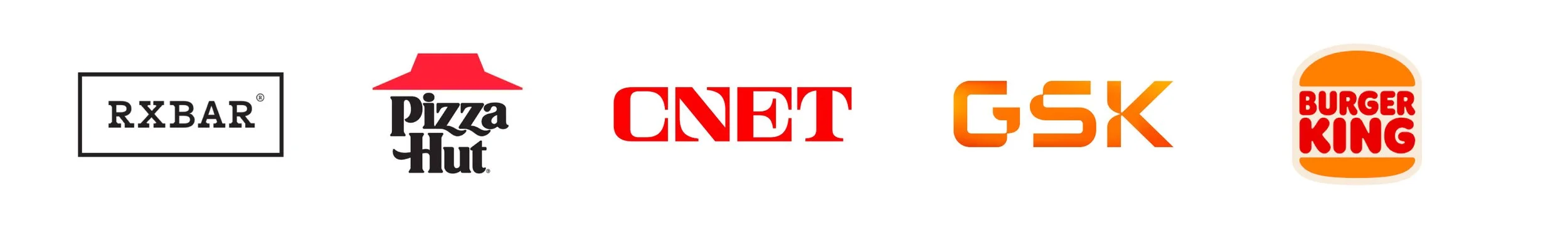
While many brands arguably got the update they needed after many years, others took a step backwards. Please note not all of these are examples of what I would consider blanding, but rather good switches to maintain their brand strength on mobile devices.
Why is it this way though? Why did form need to lose to function? Look no further than your phone screen. Even on bigger screens, small lines within logos become blurs as many fail to stop and see the logo they thumb by. These brands needed a logo to become more and more thick and simple to increase their visibility in our fast daily lives. The litmus test for brands quickly became the ability to read it at a size that previously you may never have seen prior to 2010. It no longer required the individuality of each piece of the brands logo.
If you want to know more, read Investigating the Homogenization of Web Design: A Mixed-Methods Approach to learn about homogenization in web design.
How it affects us all
This comes full circle as many brands who have not yet made a change or are seeking redesign and rebranding are viewing their competition in the same space and starting to pull similar assumptions. The world of design is changing due to mobile devices becoming the prominent media tool of choice. Whether you pledge to never use a touch screen phone again or embrace our cellular overlords you cannot avoid this new norm. So how can you embrace it without being consumed by it?
For starters, let’s try not to rush immediately into the open arms of sans serif fonts when other type families are ready and willing to pull some weight for you. With amazing choices on slab serifs and modern or transitional serifs how could you possibly tell Helvetica you’re ready for marriage? In addition, changing those fonts to personalize for your brand makes all the difference. See a few examples below on what I view as good design over their previous iterations in recent years.
There are also many tools you can use to fight mediocrity and still produce good logos and branding. Tools like Logo Lab and polling with Qualtrics or The Harris Poll can reveal information ranging from balance of image and lines to your targeted audiences perception of what you’ve created.
When in doubt, just test it out! Branding and logo creation can quickly take a turn toward the bland if you let it. Remain conscious of it and look outside the behance’s and designsperations for a unique perspective on how your brand can develop.
